 About 5 years ago when working for a large retailer we put together a program of multivariate testing on the website checkout process in order to try and reduce the number of people abandoning their shopping basket.
The results – We managed to increase the conversion rate of the site by 11% over a 6 week period of testing and tweaking – this equated to £1 million on the bottom line annually.
After seeing those results it is fair to say that I have been interested to the point of obsession on how much difference the right layout, the right copy and the right design can make to a website’s performance.
This post is going to take you through the things that I consider key to successful landing page optimisation – most of the work I have done with landing pages has been for PPC campaigns but the principles remain the same regardless of the source of traffic, unless you are building a page solely for SEO traffic generating ability.
This post will be focusing on improving your conversion rate.
Here are my 5 tips on creating the perfect landing page.
1) Understanding your target audience’s needs
The way that landing pages need to be optimised varies greatly from site to site. The best place to start is with some pretty basic thinking around who your customers are and what they need. You need to distil this down to one thing. It can be tempting to try and create a page that has something for everyone and that has a number of calls to action each that appeal to one segment of your customers, however, what we have found is that you must resist this temptation and stick your neck on the line by staking it all on one core benefit.
So what do your customers want? They want simple clear solutions to their problem/s.
You have to make things easy for people.
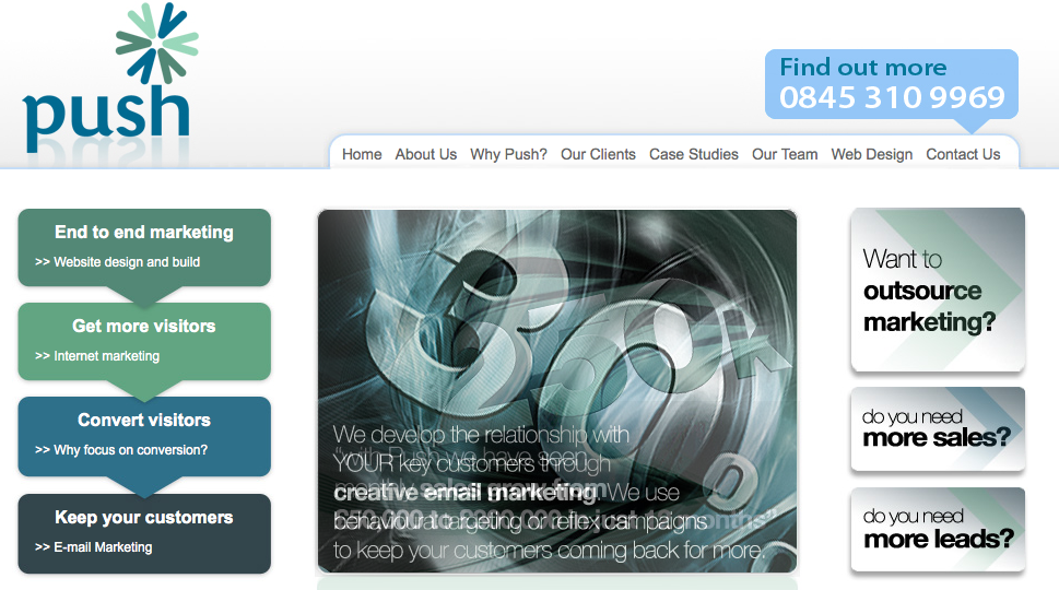
Look at the difference between the following two landing pages. I searched the keyword “PPC Consultant” in Adwords and clicked on (apologies guys) 2 sites to see their landing pages. I clicked on the first and third results.
Firstly, the landing page used by Push was their homepage and there was no continuation between the keyword and the ad with the landing page. The keyword searched was “PPC Consultant” so the user (me) was definitely looking for a PPC Consultant, the ad said “PPC Consultant” and appealed to me because of the mention of the Adwords certification. But the landing page did not mention PPC or the Adwords certification – the landing page was mainly asking me questions (really dumb questions), but as a user I do not want questions I want to be given answers and solutions.
The Periscopix page was a lot better – they are straight in with a solution and a starting point – a free review of my PPC account. They then go on to explain this and also introduce the staff on their team that will do the review (cannot be seen below). The page has one clear aim and it is appropriate for the audience.
2) Give the visitors a credible reason to work with you/buy from you
There are many ways to write a landing page but a well known technique created by the direct marketer Dan Kennedy is the PAS technique. Problem-Agitate-Solve
The idea is that you split your landing page (or sales email) into 3 distinct sections:
1) Problem – you identify the problem and bring it out into the open and explain it so that the user is now thinking clearly about it.
2) Agitate – You masochistically rub salt in the wound through elaborating on the subject.
3) Solve – You introduce your product/service as the solution.
But why should they use your solution rather than anyone else’s solution?
It is a good idea to use social proof:
- Customer testimonials – these can be written or even better; use videos.
- If your product/service is of high value and a considered purchase then use case studies of how others have used your product/service to solve their problems.
- If you have some impressive past customers (e.g. brand names) then show off this fact.
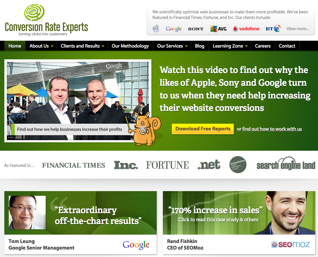
Look how the Conversion Rate Experts do this (they are one of the world’s leading specialists in improving website conversion rates). Basically the whole of their homepage is given over to social proof; they have impressive customers’ names and logos plastered all over the place as well as case studies and testimonials; they try not to do the speaking but let others do it for them as hearing a message from a peer who was in the same situation you are in now is both reassuring and persuasive.
3. Good landing page optimisation is about being specific
When a user arrives on a new site you have less than 5 seconds to convince them to stick around, people are not willing to spend ages searching around your site for answers, unless they have a strong reason to do so. Ideally you need to give specific details on exactly what you are offering and the benefits. For example; if you are selling some software that saves people time and money then give specific examples from your existing customer base (or even your own experience of using your product) on how much time you can save them e.g.
Save 2 hours per week and £500 per month for your business.
rather than
Save time and money for your business.
When planning your landing page you should make 4 lists:
- What problems can your product solve?
- What are the specific benefits of using your product?
- What is unique about your product – how can it be differentiated from the competitors?
- What do the customers need to know – what are their concerns/anxieties?
Then on your landing page you need to clearly spell out the benefits and how they solve the problems of the customer and then follow this with specific detail on why your product/service is the best solution to the problems – do not hold back; this is your one and only shot at each customer so make the most of it. The over-riding tone should distil trust that you understand the customer and have the right solution for them.
Most important is the headline as this will be just about the only thing that everyone reads; ensure that this is clear and as specific as possible in spelling out the main benefit to the customer.
4. Ensure that your design is consistent with your copy
To achieve all of the above your layout and design is just as important as the copy. People read a lot into the design of everything that they come across. We make snap judgements based on the way things look.
We do this with people, places, books (remember the old saying) as well as websites and pretty much everything that crosses our path.
As an example; I have walked out of plenty of restaurants after taking a look around and just getting a bad vibe about the place before I am actually presented with any food. The decision is made on things like the decor of the place, the attitude of the staff, the menu (how big is it?), the music, the lighting, how busy it is and what it smells like – all of these indicators are relatively subjective (except smell) and could easily be proven wrong by some incredible food but as humans we constantly learn to be selective and to trust our past experiences and instincts.
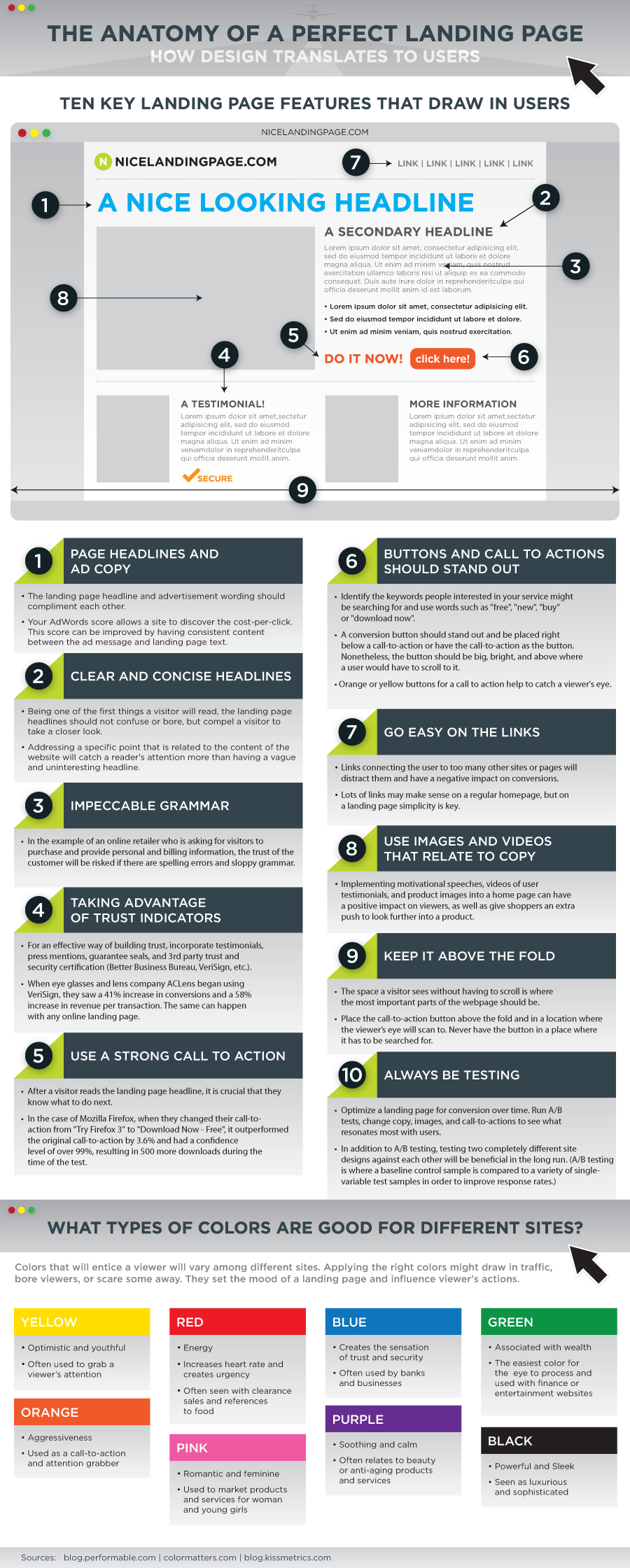
All of these elements (except smell) will be judged by your visitors through your landing page design. Your design has to work in partnership with your copy to convey your message well. As you will see in the infographic below – colour carries meanings so you need to ensure that you are using the right colours to achieve your goals. Very important is the layout of the page.
The main thing is that you have a call to action above the fold on a landing page – this is the buy now button on an e-commerce site or the contact us form, free download or free trial if you are after leads. Getting the hierarchy right from the headline to the call to action is vital – you want to take users on a clear path from using the headline to make it clear that you have the right solution for them, to then giving some more information in the way of social proof (testimonials, customer logos, case studies) to the call to action.
If your product or service needs a fair bit of explaining then it is no problem to have a lengthy explanation of the benefits following the main call to action button – if you can grab the users attention with the headline and social proof content, follow this with the call to action to make it clear to them what the next steps are then they will know what to do when they are ready so you then have the freedom to go into more detail and then repeat the call to action. But do not omit the early call to action as it carries a risk of you giving additional and unnecessary information to those who are sold in the first few seconds on the site.
For more detail on the design of landing pages take a look at this great post.
This fantastic infographic by Formstack gives some solid ideas for a base to start your landing page design with.

5. Keep testing your landing page design
Once you think that you have a great landing page design you need to put it to the test. There are a number of tools that allow you to A/B test. The most popular and common is Google Optimiser which has just been integrated into Google Analytics. Another great tool is Maxymiser – although Maxymiser comes with a price tag I have found it to be a great tool, backed by a knowledgeable and hard working team who can help you with ideas and changes as well as bringing best practice learning’s from their other clients. KISS Metrics is another high quality option as their tool can also be tied in with your database to give you insight into the kinds of customers that your different landing page options are appealing to – very powerful.
With all tools you can run simple A/B tests where you set a goal for a page and then run the old and newly designed landing page in a trial for a set amount of visitors to see which page is most effective at achieving the assigned goal.
You can also use multivariate testing for high traffic pages where you can test a number of factors on a page at the same time – e.g. you may switch out the colour, change some text, trial a new inspirational image etc all at the same time and you want to know which combination has the best performance; multi-variate testing can allow you to do this.
Another useful tool for judging and understanding landing page performance is Crazy Egg – this tool allows you to run heat mapping tests on your pages which shows you where on the page users are clicking so that you can understand what the most important factors on your page are. This allows you to determine what should be tested and changed.
Finally you should spend a lot of time with Google Analytics looking at things like the time spent on the page and where people go in your site from the page. You can understand whether your new landing page is creating a more in-depth interest in your business that causes people to spend more time researching your services. Do more users share the page socially or do they leave the site after visiting your page – there are lots of insights to be had from this tool.
That’s about it – I hope that this has been useful; please leave a comment to let me know.


